As you may have seen, Asda has been getting into some hot water in the press for their rebrand of their Essentials range.
Some people have said that the brand is making customers feel ashamed for choosing the ‘inferior range’, however Asda have hit back by saying they don’t understand why people would feel embarrassed for saving money, and that their customers are loving the range.
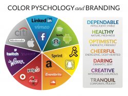
Colours within marketing can be very cleverly used, and we can guarantee that the brand managers at Asda will not have chosen yellow at random!
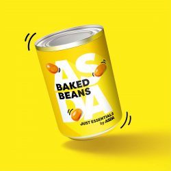
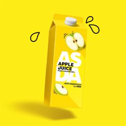

Did you know – yellow is an emotive colour; not only is it eye catching, it also encourages feelings of warmth and can be seen as fun, energetic, cheerful and can even trigger happiness. So what Asda have actually done, is create a brand within a set of products that do the opposite of make people feel sad.
Other brands that have done this well are Ferarri, McDonalds, Hertz and IKEA. IKEA is probably the best example here: the people most likely to buy their products are new homeowners, or those making their next step in life – moving out, decorating a nursery – usually feelings of happiness and optimism.
When we chose to give GB a brand refresh, we made sure to include a bit of yellow within our colour palette to invoke the same range of emotions. Putting your business in the hands of a third party can often be overwhelming, but right from the outset we want you to know that you’re in safe hands with us!
Have a think about other top brands and why they choose the colours they use – we can guarantee you won’t see branding in the same way again!